INTERVIEW WITH PHILIP CORNWEL-SMITH
In 1994, after just four days in Bangkok, accomplished writer, editor and photographer Philip Cornwel-Smith soon found himself at the helm of the city’s first listings magazine, Bangkok Metro. Born and raised in England, the Briton went on to work as the editor of Bangkok Metro for eight years and put together four editions of the Time Out Bangkok guidebook before penning the iconic, best-selling book Very Thai: Everyday Popular Culture, originally published in 2005, with a second edition in 2012.
A celebration of Thailand’s pop culture and street life, Very Thai delves beyond the clichés to reflect the dramatic changes in the country as it modernized and reveal the casual, everyday expressions of Thainess that both delight and puzzle. In a follow-up to Very Thai, 15 years after it was published, Very Bangkok: In the City of the Sensestakes an alternative look at the city’s subcultures and thematically navigates the tensions between creative chaos and dreams of order.
“All the way through the book, there’s this fight between chaos and order. There are forces of chaos and forces of order constantly interplaying.”
― Philip Cornwel-Smith

Photos by Philip Cornwel-Smith.
As the founding editor of Bangkok Metro, in a city that had never previously had a city listings magazine, what was the perception of a consumer-focused publication?
Philip: “The perception at the time was that there wasn’t much going on, that it was all very local without much international apart from the hotels, and magazines that published interminable information about food promotions and interviews with hotel general managers. Some people said that Metro magazine worked because I didn’t know it couldn’t be done. I hadn’t had a background in Bangkok, so I didn’t know the fatalistic side of Thailand. An awful lot of things in Thailand are fatalistic and it doesn’t take long for expatriates to become fatalists too.
“But I’m not like that, I tend to revel in the ambiguity of places, and Bangkok is very ambiguous. The ways that Bangkok is presented to outsiders, and also by Thais to other Thais, often don’t represent its true nature. They’re either too pristine or too lurid. So pretty much all the things I’ve done in the Thai media have been about presenting other perspectives of Thailand, as an antidote to the promotional, glossy version.”
How did the idea of Very Thai first come about?
Philip: “While I was editing [the Time Out Bangkok guidebook], I was really looking to write my first book on Thailand, which was Very Thai. I’d been, as an editor, the center of a lot of questions. Sometimes they were just to do with what’s on and practical things about the city, but also I was asked a lot of cultural stuff that I had no answer to. Why is the high society ladies’ hair so big? Or why are all the school children dressed in sailor suits? And there was no answer to it. There were no sources readily available. I’d ask people about it and they would have no idea. So I gradually got the concept to make a book of everyday things that are never explained to outsiders.”

Photos by Philip Cornwel-Smith.

A discarded cover concept with a Rubik’s cube based on Thai colors.
Following the success of Very Thai, what compelled you to write Very Bangkok?
Philip: Philip: “I had intended to do an alternative guide book as a fill-in project before doing something else. But it soon occurred to me that as soon as somebody looks through the eyes that I was using to look at something, they would identify these things too. It wouldn’t have long legs as a book. So, I redid the book, completely, from another perspective which was to look at the diversity of the city. But I came to realize that I could never cover everything. And also a lot of the diversity that most interested me was starting to disappear; the city was becoming less diverse. Partly this was because of the people who had flooded into the city and made it grow so much; they had a second or third generation in Bangkok who had become Bangkokian and weren’t firstly identifying with their origin. So I redid it again.
“I wanted to do something from a unique angle – reconsidering the city through 20 senses. So it’s not a guide book by district, it’s not a history book by era, it’s not a book to do with genres such as ‘the lurid nightlife’ or ‘the expat bubble’. To cut through the many clichés about Bangkok I needed a fresh take. Yet everybody has senses, so everyone can engage with the city on a sensual level.”
Are there any similarities between the two books?
Philip: Philip: “We kept the same size dimensions and the same format, being in hardcover with printed boards. That makes the two fit together as a pair. And keeping the name ‘Very’ from Very Thai provides a series branding. Inside, the font is bigger in Very Bangkok, but it’s the same text font that’s in Very Thai: Minion, though the title fonts are different. The layout is different too, but there are certain things in common.
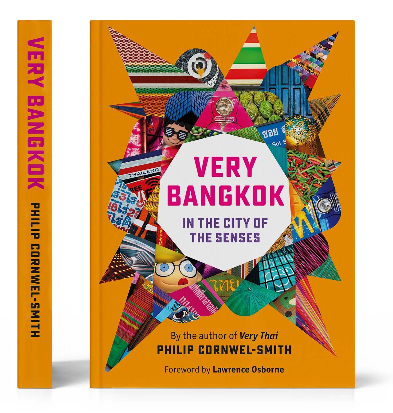
“For the cover, we wanted a strong, vivid color. Although Very Thai has a patchwork of photographs and boxes, a lot of people refer to it as ‘the pink book.’ There’s actually very little pink on the front cover, but on the spine it’s pink with yellow writing. So this pink and yellow mixture has become iconically identified with Very Thai.
“Orange is a good signal color and it didn’t appear much on Very Thai. So it stood out well for Very Bangkok. Because it’s not too dark and it’s not too light, it allows all those other pictures that Xavi put into the collage to be very strong and seeable. Perhaps people will call it ‘the orange book’!”


Prior to the start of the design process, did you have any idea of what the cover should look like or what you wanted on the cover design?
Philip: “Strong color was fundamental. It had also been beneficial with Very Thai having multiple images on the front cover, because it gave people an idea about what was inside. The idea of multiple images was in there early on, but the difficulty was making that look coherent.
“Xavi came up with this idea of the spikes and the curves. It had many inspirations, but retains ambiguity, because it doesn’t represent any one thing, rather it hints at lots of suggestions. He got a feeling that the text was full of the contrast between chaos and order, so we get sharp and rounded shapes. The publisher had described Bangkok as a kaleidoscope, and the cover has shards of pictures in a scrambled array like you get when looking through a kaleidoscope. By forming a hoop around the title, the design also evokes a Thai garland, which you can see on the Bangkok street being assembled from deconstructed pieces of flowers. Perhaps the strongest association people sense is of a durian. One of Bangkok’s nicknames is ‘The Big Durian.’ Xavi has created a graphic impression of the sharp and soft contradictions in that fruit, which has a sensory impact on everyone. His cover viscerally conveys this sense of ambiguity and sharp contrast that you find all through the city.
“I remember when I hadn’t seen Very Thai yet in the bookshops and I was wondering ‘Oh, will it be obvious where it is?’ But from 20 meters outside, I could see through the front of the shop through to the back shelf, where the book was standing out so brightly. The fact that I could see it from 40 meters away may be one reason why Very Thai has worked, so I did want a very bold cover. And for sure you can see this cover for Very Bangkok just as vividly.”
As a writer, how would you describe a successful book cover?
Philip: Philip: “Something I learnt from Time Out was that if you’re in the business of providing information for the reader, then a perception of value comes in. Very Bangkok is packed with information, it’s full of value. You may not ever read the whole of these two books, but you could feel like dipping into them. I think to express that comprehensive quality, the covers of both Very Thai and Very Bangkok give that effect of being cornucopias filled with valuable stuff.
“In terms of my aims for my book covers, Very Bangkok needed to feel like a taster of the flavors that you’d find inside. It’s very intense. Everything is very strong and impactful and gives a sense of there’s an awful lot going on.
“Ultimately, in book shops and online and so many other places like reviews, all people often see is the cover. And in the days of shrink-wrapped books in book shops, it’s harder to look through a book, so you have to get much more insight from the cover. It’s really crucial that the cover captures the character of the book.”
To order a copy of Very Bangkok: In the City of the Senses, visit:
verythai.com