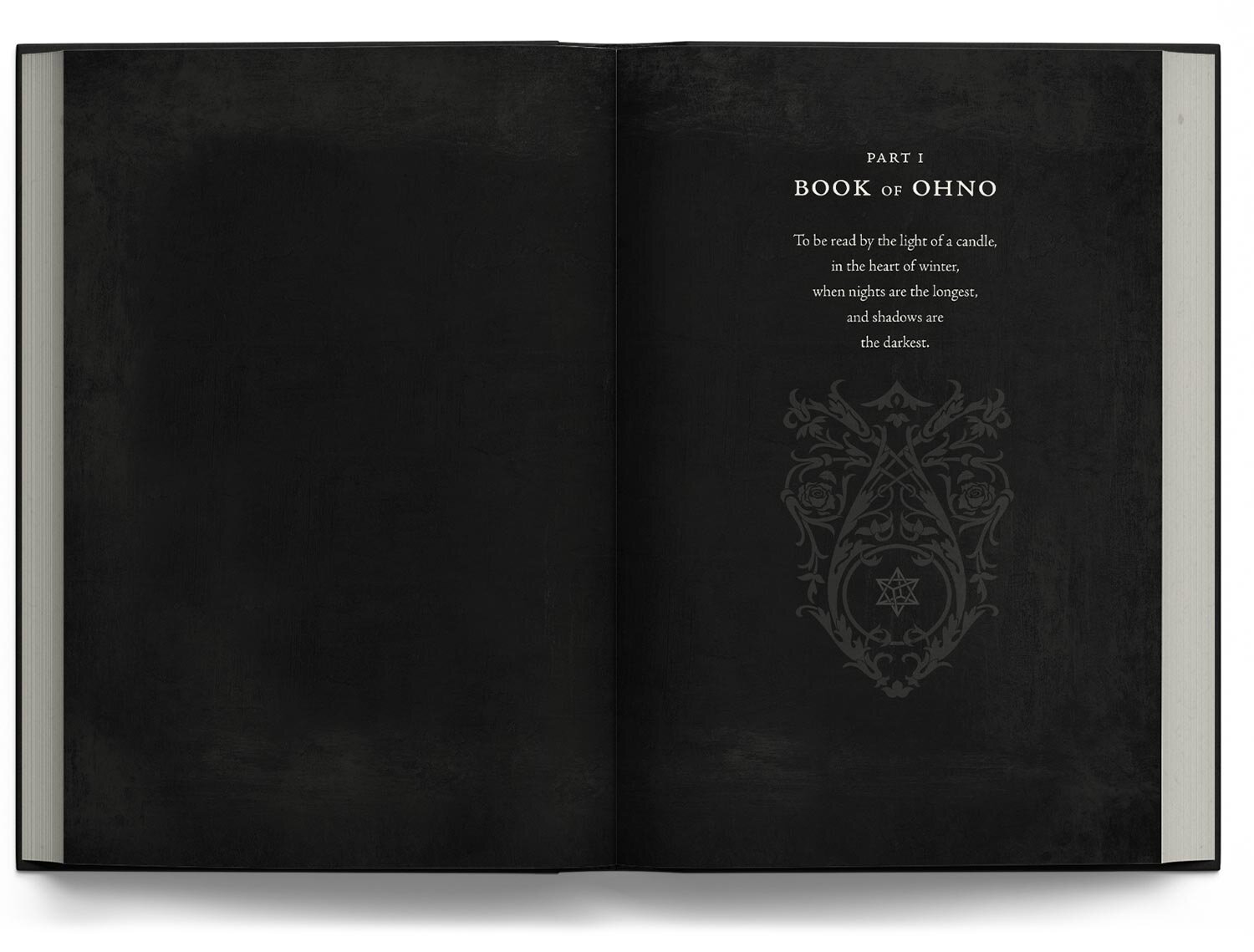
THE THREE COURSES OF UMBRA’S COVER DESIGN
“In the beginning was the Darkness: formless, empty, and alone. And its name was Umbra.”
A spellbinding blend of horror and satire, Umbra is the debut novel of Russian-American writer, artist and psychiatrist Yana Barbelo. Falling under a genre the author dubs 'archetypal fantasy', Umbra draws from the wellspring of a deep psyche where myths, fairy tales and many religious texts originated.
A fan of 19th-century book covers, the author requested a design rich in symbolism with the feel of a holy book, only more sinister and less austere, and which incorporated atmospheric illustrations by the author herself. To showcase the book’s poetic and thought-provoking tone, our cover cooks suggested a simple but iconic cover design featuring a powerful integration between images and words and a dichotomy of light and shadow. And as the author’s first time working with a book cover designer, our cover cooks were on hand to offer advice and guidance throughout the cover design process.
Appetizers
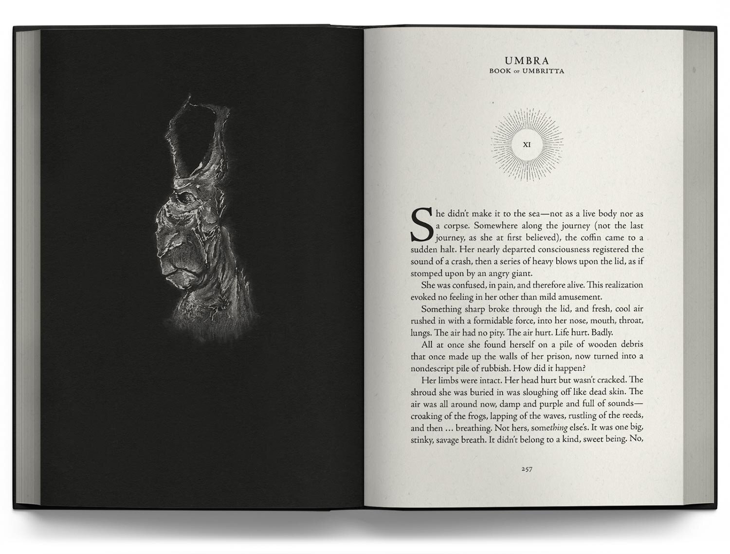
To complement the author’s illustrations, our cover cooks created four design recipes that had the look and feel of an incunabulum and provided the cover with a mystical, magical aura. Although attractive and suited for a young adult audience, designs based on the author’s illustrations appeared visually too busy. At this early stage in the design process, it was clear to both the author and our cover cooks that the detailed illustrations would be best suited for the interior design as opposed to being incorporated in the front cover.
To resonate with the book’s weird, "phantasmagorical sweep", a four-quadrant alchemical manuscript-inspired cover made use of an unorthodox typographic composition, black sun at the center, and symbolic images in each of its corners. While appealing to the author, the typographic composition of this design could prove challenging to readers and lead to them potentially skimming past the book. To address this concern, our cover cooks suggested placing the title in the center, thereby preserving the concept but making the title easier to read.


Ultimately, it was the elegant floral motif design reminiscent of an hourglass that the author’s eyes were most drawn to. Rich in subtle symbolism, the white window illuminated with the black sun was perfectly balanced by the surrounding textured shades of black and gray and best suited the author’s palate.
Mains
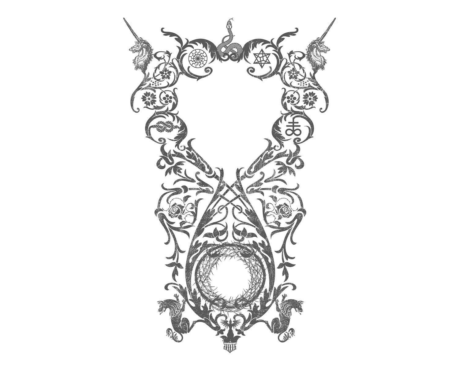
Seasoning the design’s recipe, further symbolic details featured throughout the book were also added to the hourglass-inspired design, including two elegant unicorn heads serving as horns, two wolves evocative of clawed feet, a crown of thorns suggestive of a menacing open mouth, and two mirrored snakes creating a strong central axis. The addition of these elements offered richness and complexity to the design. Several details were also replaced with occult symbols to convey the tension between opposite forces: a nautical rope knot in the shape of the infinity sign conveying the ability to stand your ground opposed by the Leviathan cross to the right; likewise, this duality is evident in the black sun as a destructive force on the upper left, countered by the Kabbalistic power of Merkabah descending from Heaven on the upper right. These simple yet powerful symbols completed the hidden meaning in the book’s cover, all bound by the unending continuum of the lemniscate.
To balance the detailed designs of both the front cover and the interior, simple, crisp text on the back cover as well as the title, author’s name and iconic black sun on the spine were among the final additions to Umbra’s intricate cover design.

Incorporating the author’s dark and intricate illustrations in the cover design, to later appear as a thumbnail online, would have undervalued the quality of the illustrations; however, were the perfect addition to the book’s interior as openers to the chapters. A black sun and floral motifs were also added throughout the interior to connect visually with the front cover.


Dessert
To complete the cover, the author required a logo design for Pleroma Press to be placed on both the back cover and spine. Playing with the double P initials, our cover cooks created an imprint logo that is simultaneously reminiscent of an antique key or pair of scissors as well as a Hermetic symbol.